UI/UX, Icons, spots,
& hero illustrations
MOBILE APP - UI / UX
Project Overview
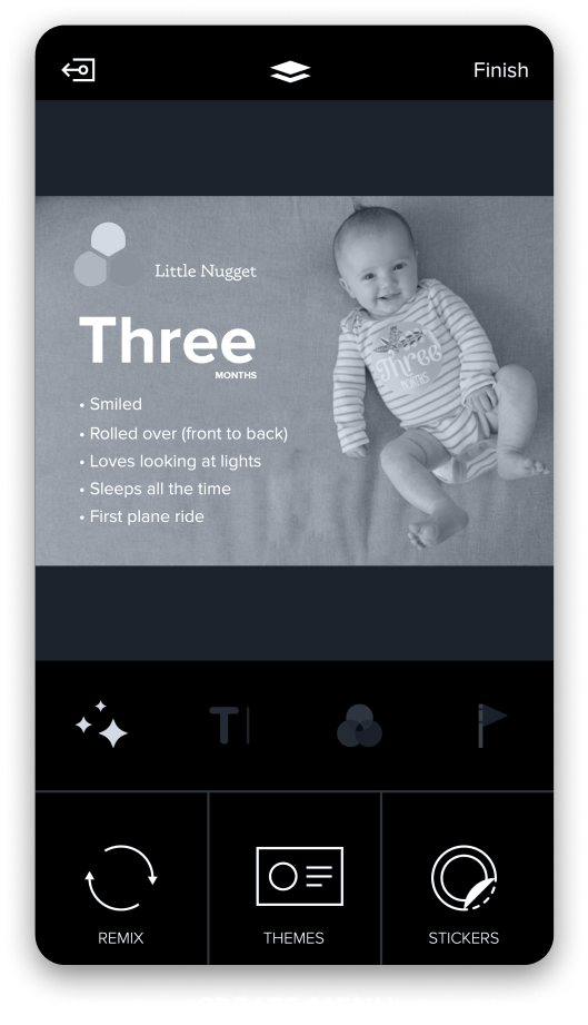
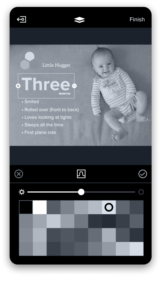
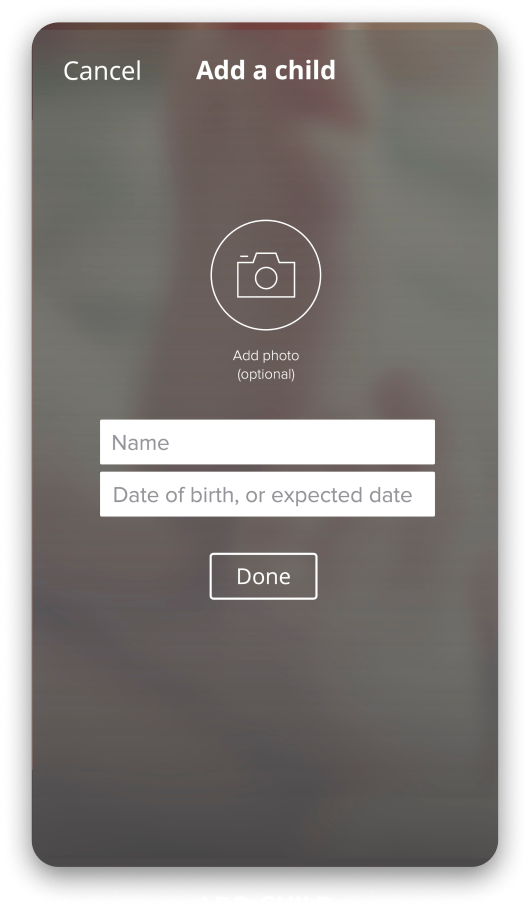
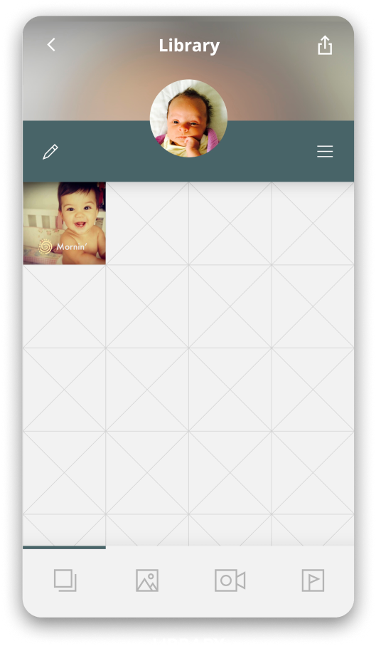
Little Nugget is an Instagram style platform for parents (specifically mothers) that emphasizes privacy. Little Nugget’s secure platform parents can decorate photos and videos with text and fun stickers, create custom templates or apply beautifully designed templates curated by Little Nugget. Post to you hearts content knowing that only people you’ve invited in to your close circle can see your posts.
This was my first ever true UI/UX project... and it shows. Over a 3 year period I developed my skills pro-bono, launching me into the career I hold today. As you scroll through the timeline from 2015 - 2018, you can see how I earn my stripes in UI fundamentals such as, userflows, accessibility, and design library management.
My Role
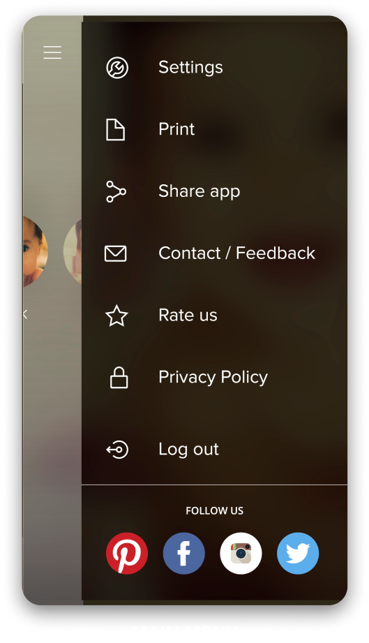
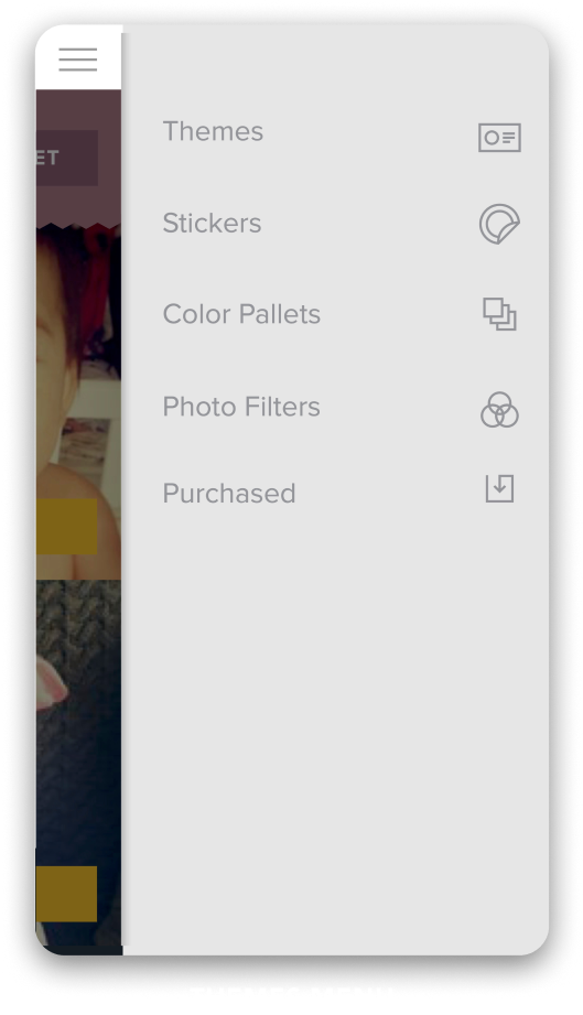
As the sole, Lead Designer I was responsible for the experience from end-to-end. Working closely with the founder (an ex-Microsoft global marketing director) I developed UX flows, wires, prototypes, custom illustrations, and of course the final hi-fi screens.
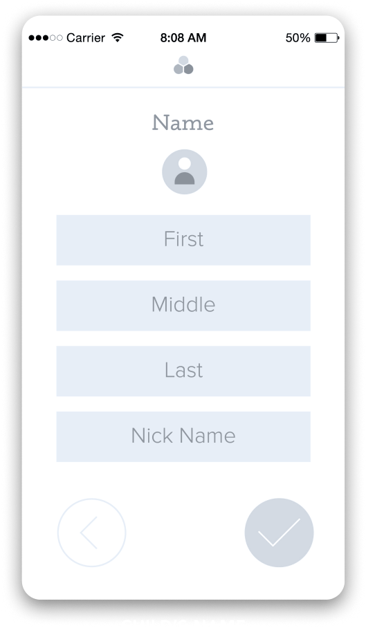
UX Flows
Evolution of the Experience
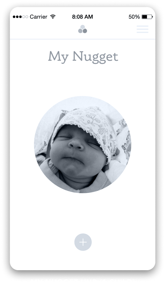
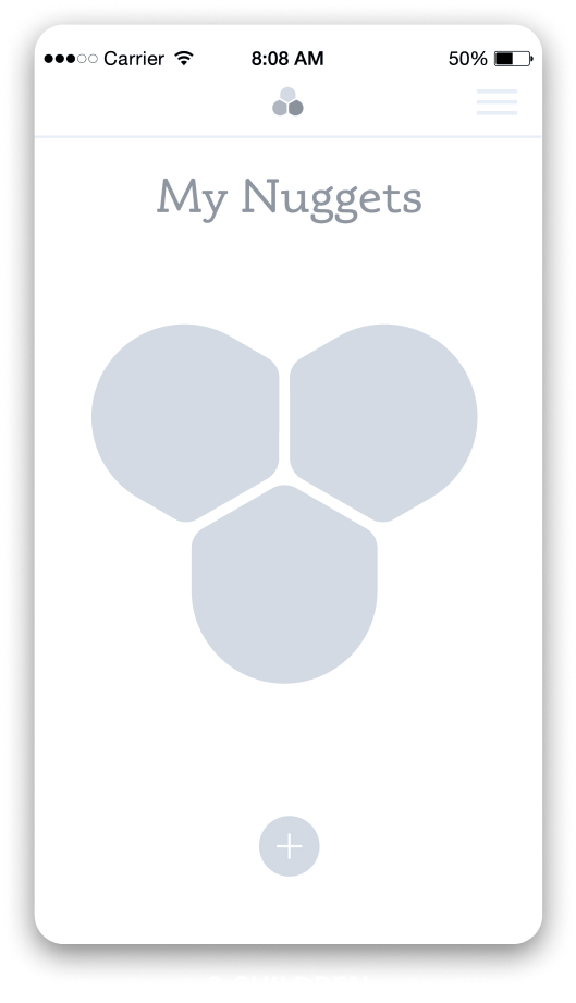
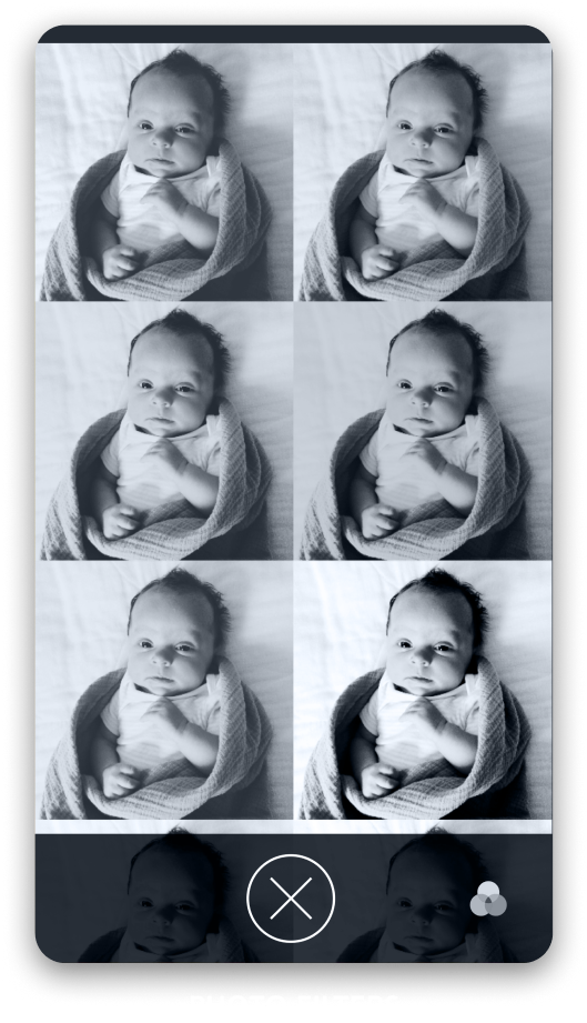
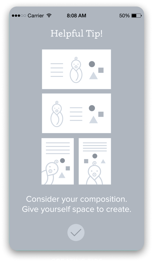
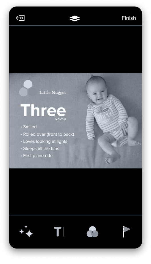
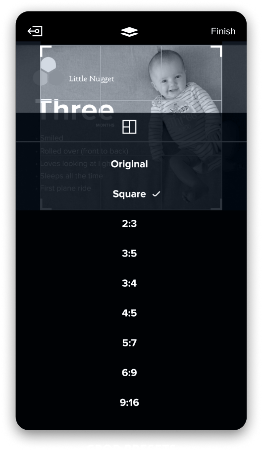
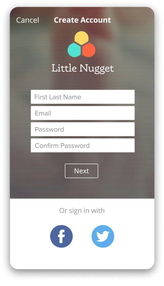
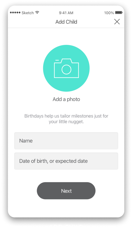
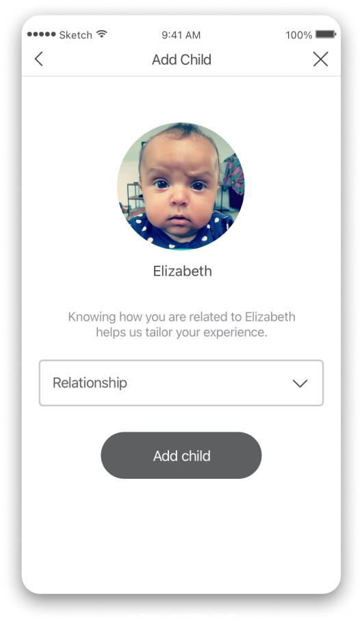
From wires to final designs. This is where I trained in product design.
UI/UX, Icons, spots
& hero illustrations
MOBILE APP - UI / UX
Project Overview
Little Nugget is an Instagram style platform for parents (specifically mothers) that emphasizes privacy. Little Nugget’s secure platform parents can decorate photos and videos with text and fun stickers, create custom templates or apply beautifully designed templates curated by Little Nugget. Post to you hearts content knowing that only people you’ve invited in to your close circle can see your posts.
This was my first ever true UI/UX project... and it shows. Over a 3 year period I developed my skills pro-bono, launching me into the career I hold today. As you scroll through the timeline from 2015 - 2018, you can see how I earn my stripes in UI fundamentals such as, userflows, accessibility, and design library management.
My Role
As the sole, Lead Designer I was responsible for the experience from end-to-end. Working closely with the founder (an ex-Microsoft global marketing director) I developed UX flows, wires, prototypes, custom illustrations, and of course the final hi-fi screens.
UX Flows
Evolution of the Experience
From wires to final designs. This is where I trained in product design.
































SOLIDIFYING
Ratios
Primary Colors
The primary color should be displayed most frequently across screens and components. However, the primary color should remain balanced and not overload screens with callouts that compete with one another. For example, aim to max one primary color CTA per page.
Secondary Colors (Illustration)
Secondary colors should on illustrations and packages. Outside of that they should be be used sparingly to complement the primary colors and highlight specific UI elements.
Neutral Grays
Neutrals can be used for backgrounds and written text.
Illustrations
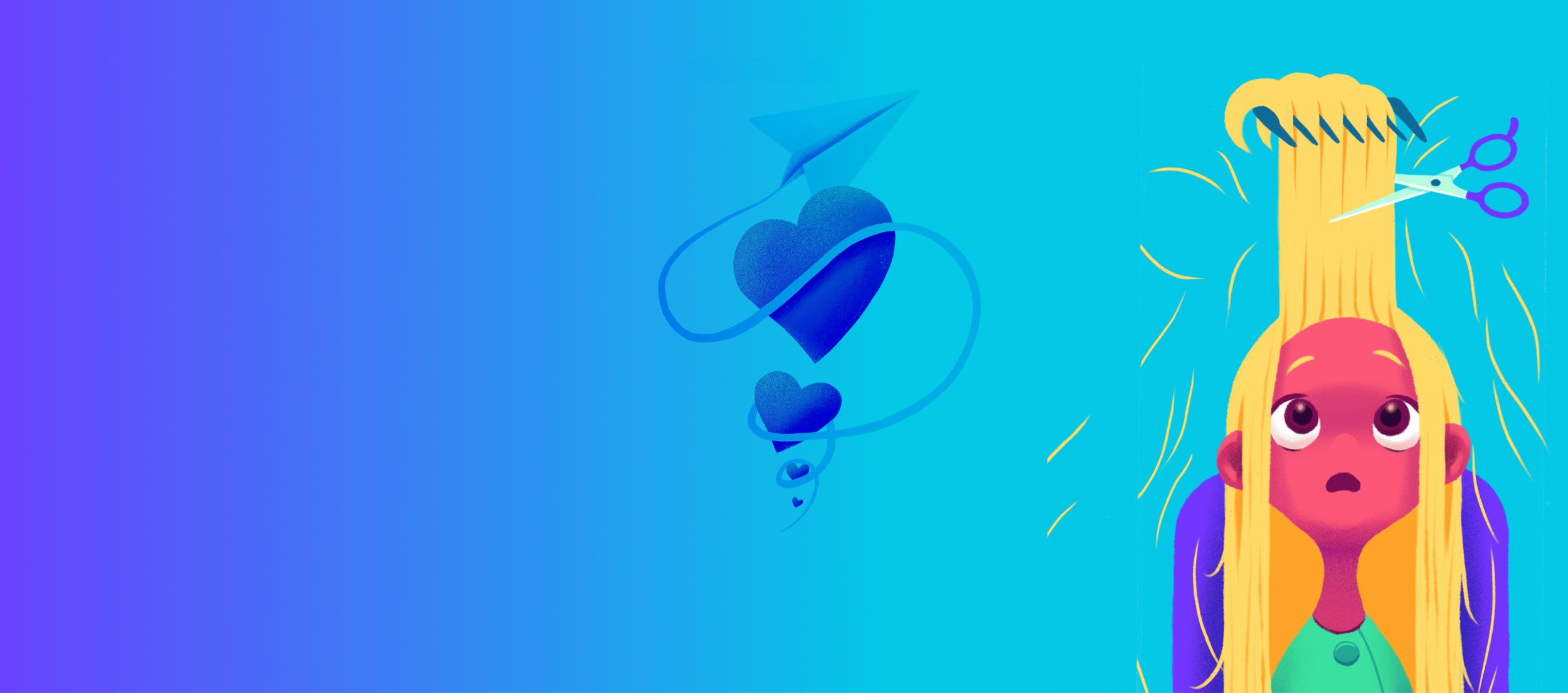
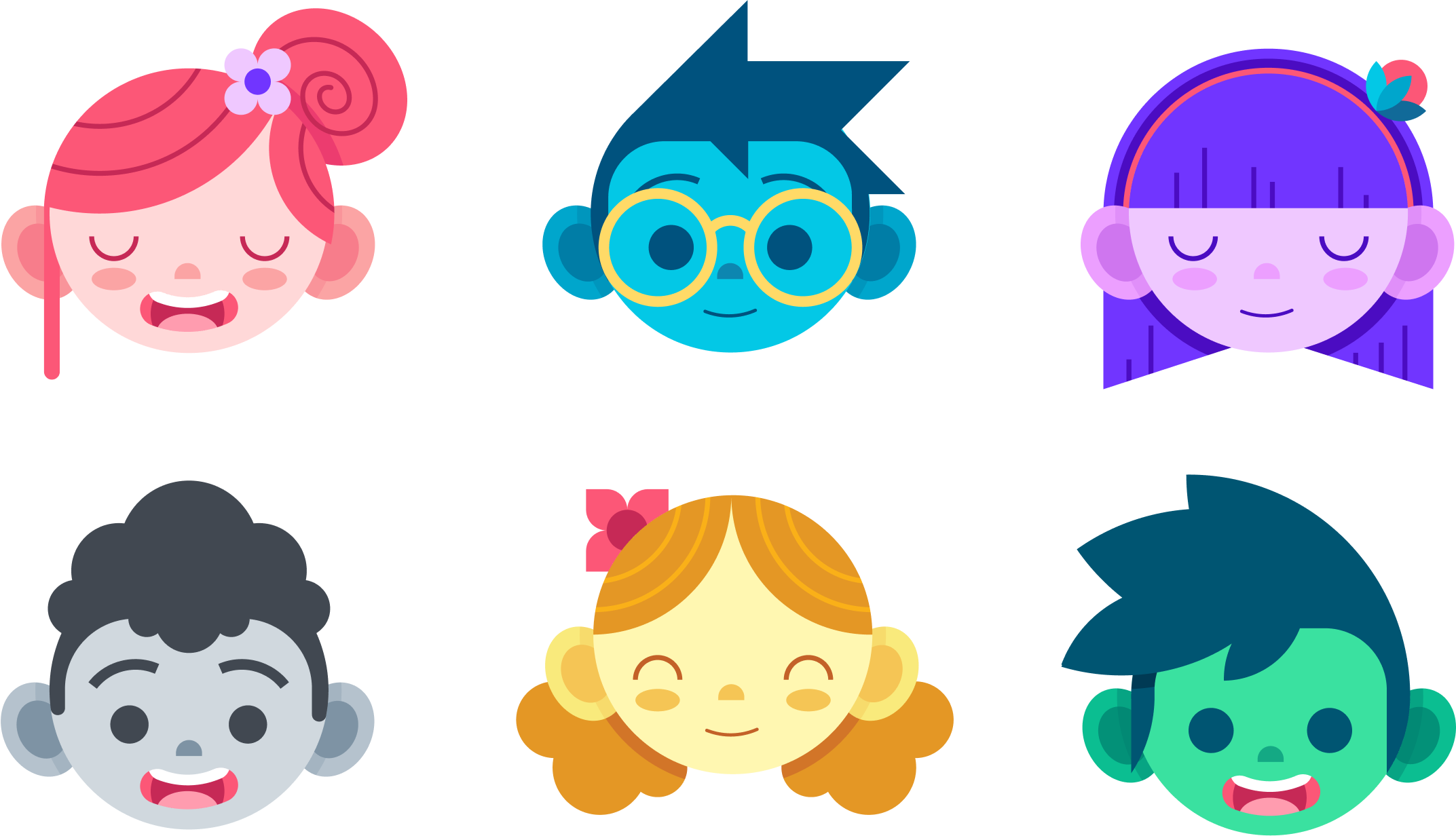
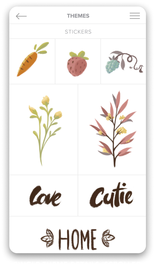
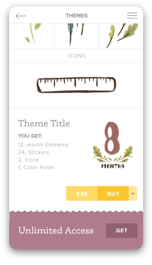
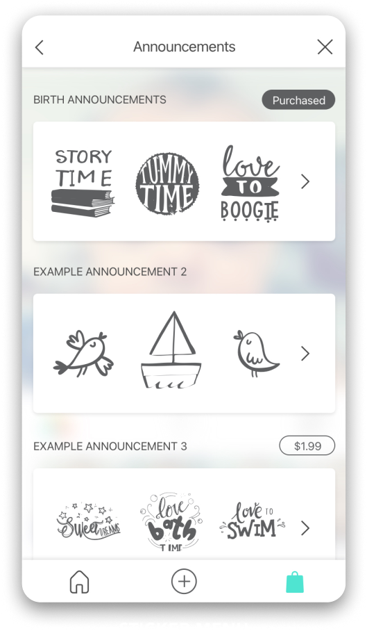
The style for Little Nugget® had to be playful, messy, and a little bit dangerous. Just like a kid. The color pallet is punchy and full of pop.
Story Telling Heroes
Pencils to Pixels
Whether it’s on paper or an iPad, most of my ideas start as a sketch. I don’t usually like to work in raster when I illustrate for screens, but the style I contrived demanded more texture and character.
Spot Illustrations
Styles & Components
THE
Prototyping is my pride and joy. If you don’t have working context of what you’re building you can’t make solid design choices. Prototypes tell a more complete story, which helps communicate with stakeholders, creates more accurate user testing results, and makes handing-off to dev a breeze.

